Mespack
New experience through machine touch screens
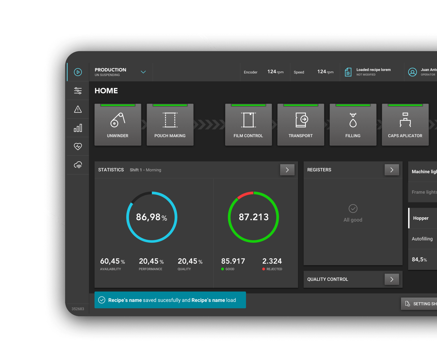
We improve the processes efficiency and operators’ satisfaction when using Mespack machines.
+ Efficiency
in the process of the machines
+ Satisfaction
of operators with the machines' performance
Client
Sector
Industrial
Methodology
User Research
Usability Testing
User Experience
Discovery
User Interface
The Challenge
Improve the experience of operators in the use of machinery
Mespack is a company that offers machines for the production of packaging. They challenged Multiplica to improve the current interface of the touch screens available on its machines in order to improve the experience of the operators who use them on a daily basis and generate more efficient processes.
"One of the most difficult challenges we had in redefining the user experience of touch screens on machines was gaining a thorough understanding of how operators and the surrounding environment interact with them." We intended to provide a streamlined experience in machines that could be adjusted to meet the demands of each client, so there are a lot of variables to consider."

What we did
Research to understand the operators’ needs and expectations
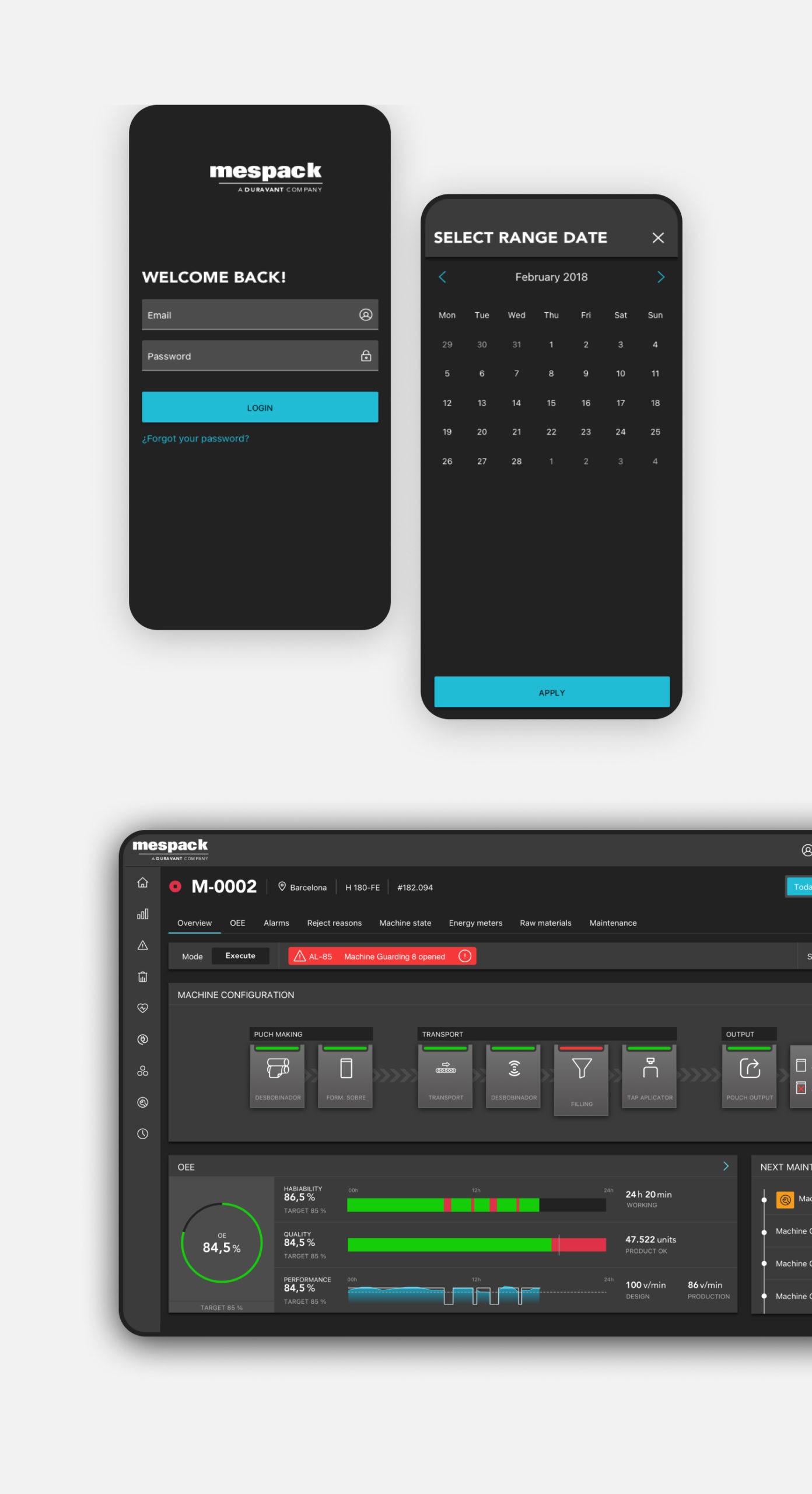
We began the project with a Discovery phase in which we focused on thoroughly understanding how the machines functioned and what the operators' experience in the facility was. To do so, we went to some of the factories where the operators worked. We were able to thoroughly comprehend the processes and characteristics that the end user needs to know at a glance in order to know how the machine is operating (to ensure that everything is running well) and how efficient it is.
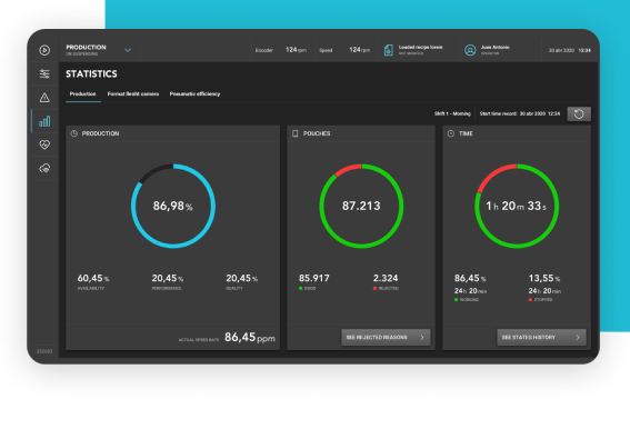

In addition, given the rotation that exists in the use of a machine, any new operator must be able to comprehend how to interact with it in a very basic and clear manner. As a result, we worked hard to create an experience that was both clear and intuitive. Web usability patterns were extended to touch displays during the UX phase. And we achieved that in a variety of ways, such as by making larger elements with more space between them, defining a clickable area that was larger than the symbol design itself, and adding pull downs and menus to the navigation.
Subsequently, the wireframes were examined to see where they could be improved. International users — Americans, Australians, and Japanese – were also tested remotely to ensure that the screens operated successfully in all markets.
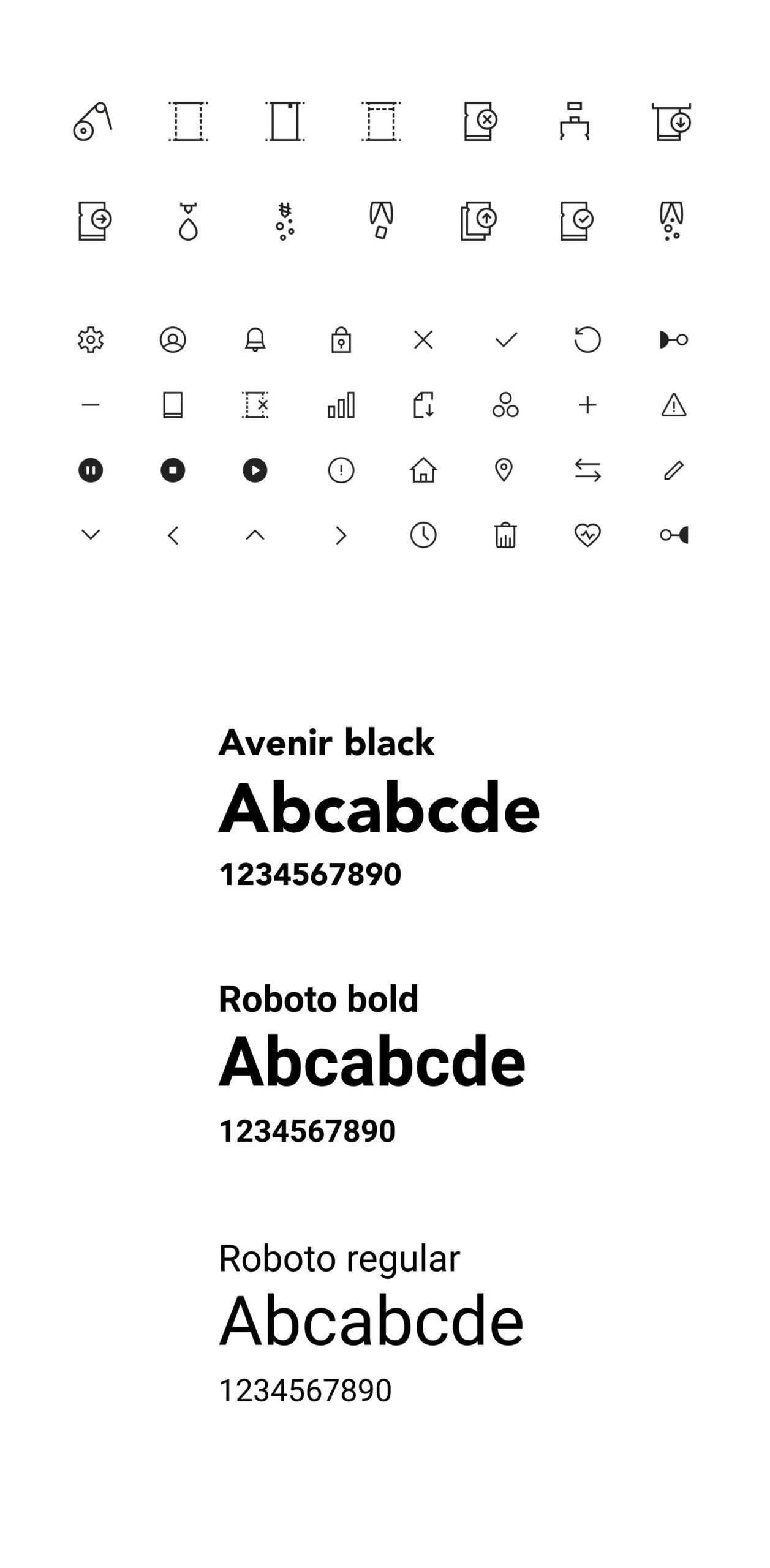
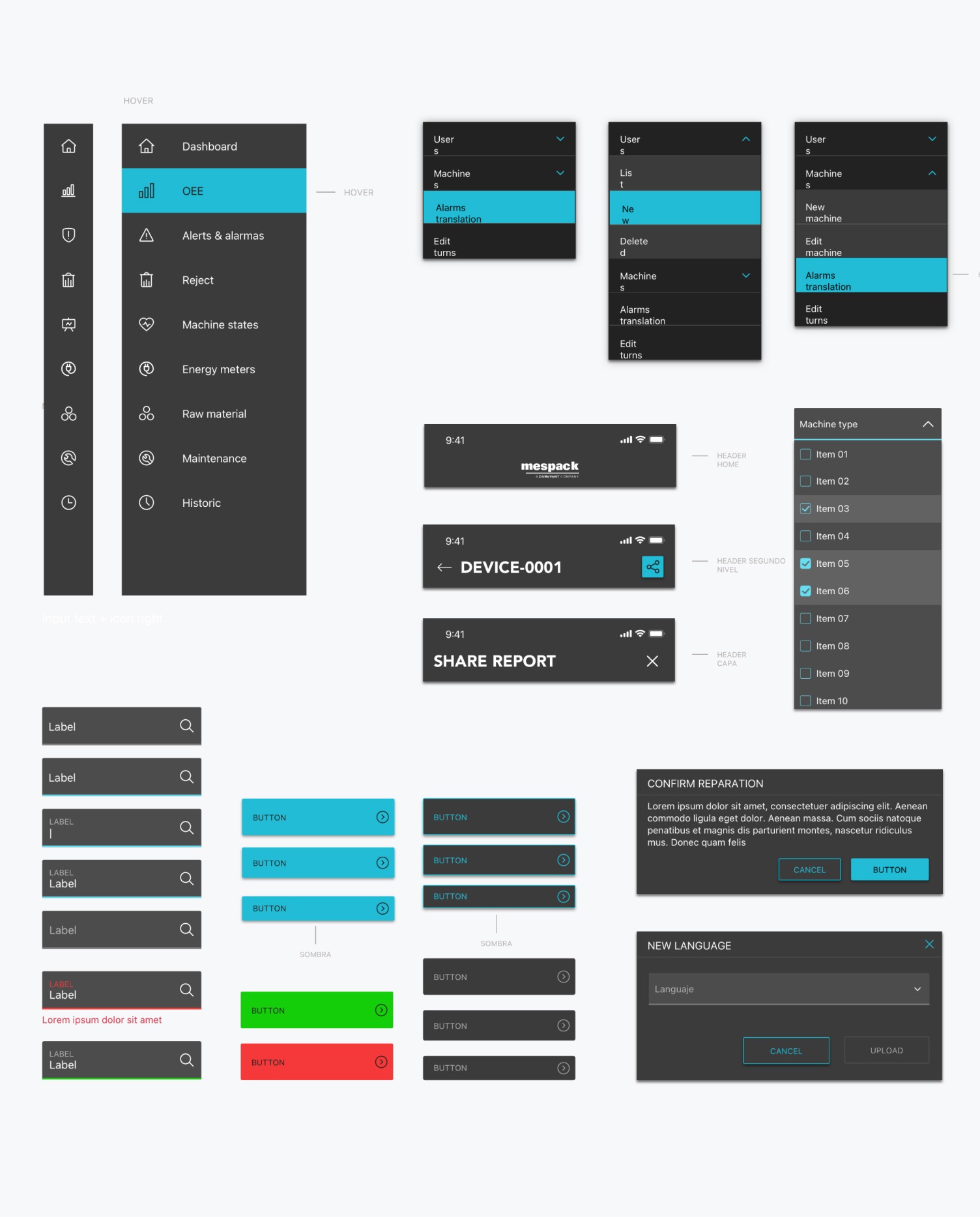
Once the adjustments detected in the tests were made, the screens were designed. All of the machines' icons were also designed, resulting in a UI Kit and a design system that had to be consistent in terms of colors, body, fonts, icons, and interactive elements, with only minor changes (coming from the device is touch or click).
Once the adjustments detected in the tests were made, the screens were designed. All of the machines' icons were also designed, resulting in a UI Kit and a design system that had to be consistent in terms of colors, body, fonts, icons, and interactive elements, with only minor changes (coming from the device is touch or click).
The project was presented to the development team in a technical session, during which we also provided them with our advice for which screen type they should implement to make the most out of the new designed experience, with all of its functions.
Key learnings
Because the interface of a machine operates quite differently and users have specific characteristics, we must forget about the web user experience approach in industrial projects. There is a greater impatience due to the need to be very efficient and react quickly to any error.
There is great value of doing field study to see how operators work and the environment in which they perform. Because there is a lot of noise in factories, we couldn't use sound resources in the interface, so we used colors instead. This allowed us to see the state of a machine from a distance.
In terms of knowledge and application of touch displays, there are few differences between countries. The iconography and navigation were universally understood, and there were no significant differences in the tests conducted.
The results
1.
Improved the efficiency of machines’s processes.
2.
Improved the operators' satisfaction with the machines' performance.
+ Efficiency
in the process of the machines
+ Satisfaction
of operators with the machines' performance
“Multiplica is a company with great human capital. In addition to their high level of expertise, they constantly made us feel like we were a part of all the improvements, and they always actively listened to us. The frequent input helped to streamline the entire process. We were able to collaborate with two separate teams within the organization. Both presented us with really interesting concepts and solutions, demonstrating excellent internal coordination. Mespack is really pleased with the final result. We were able to take a step forward in the UX and UI of our new ATHENA platform thanks to Multiplica."
Guillem Lloret
Innovation Manager at Mespack
Highlights
Good relationship and harmony with the client,
which improved the team synchronization so that the project was completed on schedule and within budget.
We were able to move forward at a good rate and overcome the challenges
of adapting to all of the constraints that arose in the midst of the Covid-19 outbreak thanks to an agile sprint delivery project.
Parallel synchronization of two company projects,
using a common iconography design system for all interfaces, approaching the machine middleware design project from another Multiplica team to maximize its outcomes.
Other relevant
projects
projects
Do you have a project in mind?
Let's work together
Let's work together